Scroll down for English version
In conversazione con Paola Liani,
co-fondatrice dello studio Paritzki&Liani con base a Tel Aviv,
alla scoperta e nelle pieghe di Angel.
Tra arrivi e partenze, approdi temporanei,
suggestioni artistiche e il vetro, quello di Murano.
Qui interpretato per Purho.
Tel Aviv la base.
Ischia l’approdo.
Parigi, Venezia, Milano… le tappe di un viaggio A/R, mensile, incessante.
Si, approdi e partenze, il viaggio come dimensione nel/del quotidiano e la possibilità di vivere fra luoghi e temporalità geograficamente lontane è una scentratura, uno scostamento, ci si trova a ri-iniziare e ridisporre il proprio programma continuamente, ciò mi permette, di mettere in forma grazie al mio lavoro, la percezione, le relazioni tra le persone, i concatenamenti tra le cose, le affezioni fotografiche in una forma conoscitiva nuova, rispetto ai fatti dell’esistenza e dunque del progetto.
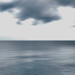
E poi c’è un centro, i luoghi radicati dentro di noi che comunque ci accompagnano per la vita fino a costruire una vera e propria stratigrafia, ed è il proprio paesaggio. Sicuramente con me scorrono gli orli di fiume fra i boschi e rovi delle colline moreniche friulane, il deserto che scende dopo Gerusalemme, l’impasto dei colori che sfumano al cielo della laguna veneziana e qualsiasi maltempo di mare brusco e veloce… cosi le città diventano altre nicchie.
Sicuramente con me scorrono gli orli di fiume fra i boschi e rovi delle colline moreniche friulane, il deserto che scende dopo Gerusalemme, l’impasto dei colori che sfumano al cielo della laguna veneziana e qualsiasi maltempo di mare brusco e veloce
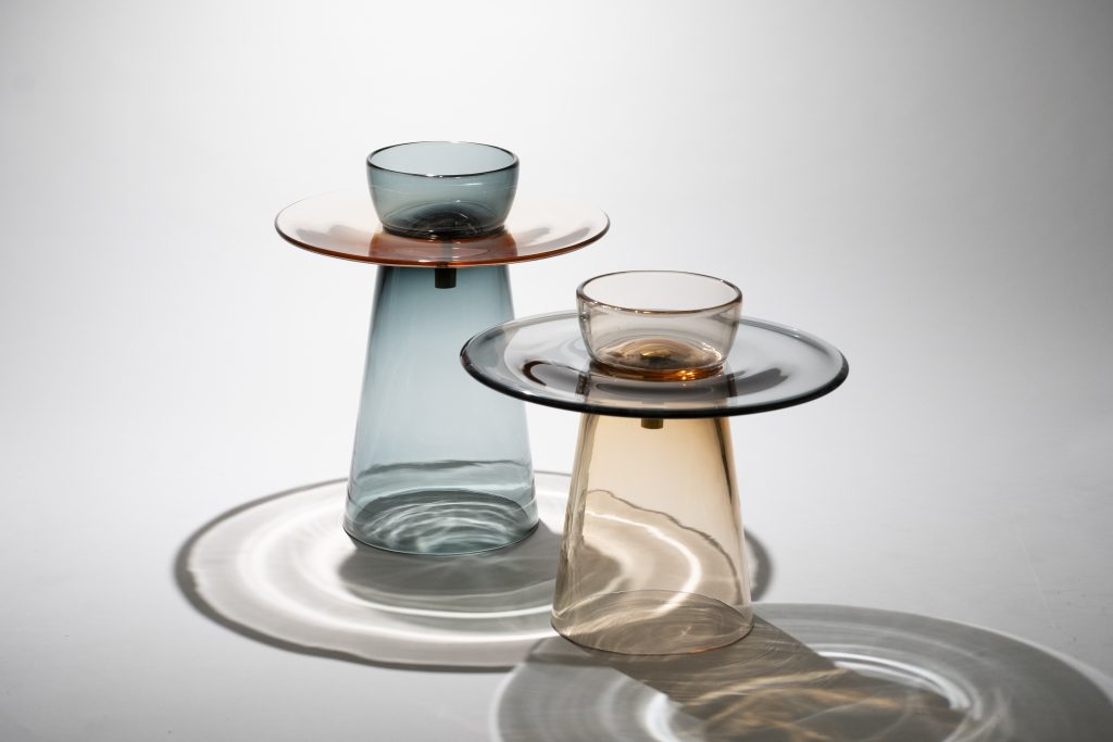
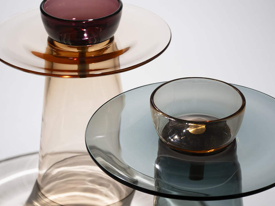
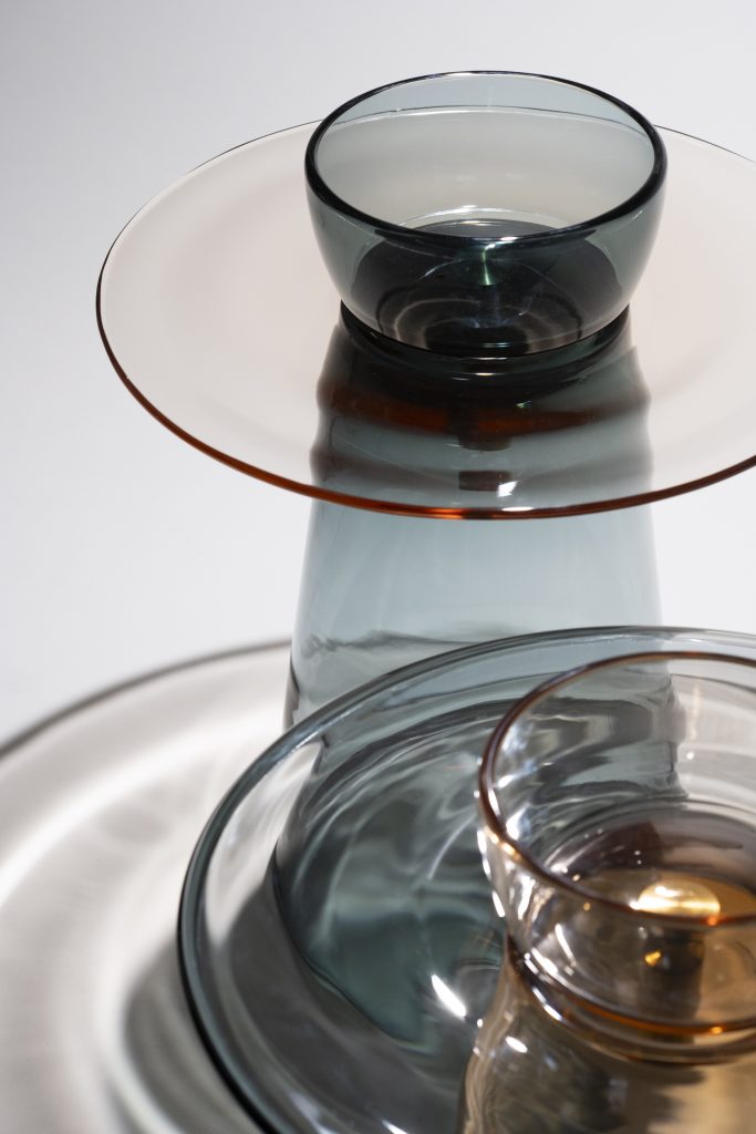
Angel by Paritzki&Liani x Purho, ph. VisualWorld
Da importanti progetti prevalentemente per abitazioni private e collezionisti ai blocchi di abitazioni urbani a Tel Aviv, al cambio di scala per quella che avete definito “una piccola architettura per la casa”. Come avete approcciato il design di Angel?
Lavorando per anni al progetto domestico e soprattutto alle sue mutazioni e rappresentazioni, e disegnando tipi e luoghi ibridi nel paesaggio domestico, come l’abitazione-museo, l’abitazione-studio-lavoro, l’abitazione-segreta-ashram e altri, l’abitazione-mimetica-difesa, quella d’emergenza, è naturale ed importante per noi far uscire da questi racconti degli oggetti che sono una mise-en-abîme, una discesa nella profondità del progetto.
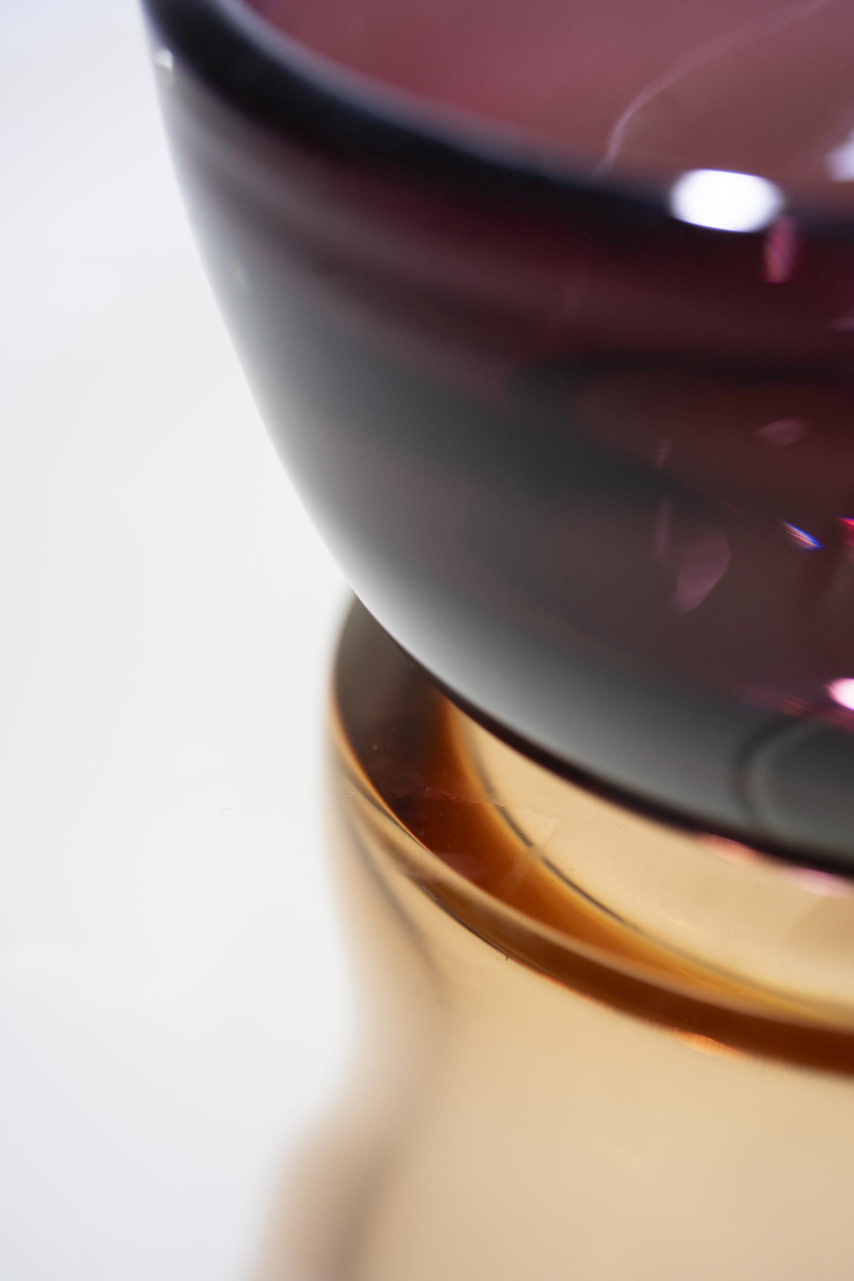
Per questo motivo anche i tavoli Angel li abbiamo definiti come piccole architetture per la casa, immaginati come oggetti che danno una tenue spinta alla nostra percezione, come una buona architettura dovrebbe dare. Sono oggetti d’uso quotidiano preziosi, trattandosi del vetro di Murano, essi creano un gioco di rimando con la luce, mutano nella trasparenza, nei riflessi e nel colore al mutare della fonte luminosa, creano per brevi istanti particolari inaspettati. Trattandosi di tavoli con altezze da 35cm e 44cm sono oggetti aperti alle diverse possibilità funzionali della vita di una casa.
oggetti sono una mise-en-abîme, una discesa nella profondità del progetto.
Angel by Paritzki&Liani x Purho, ph. VisualWorld
-
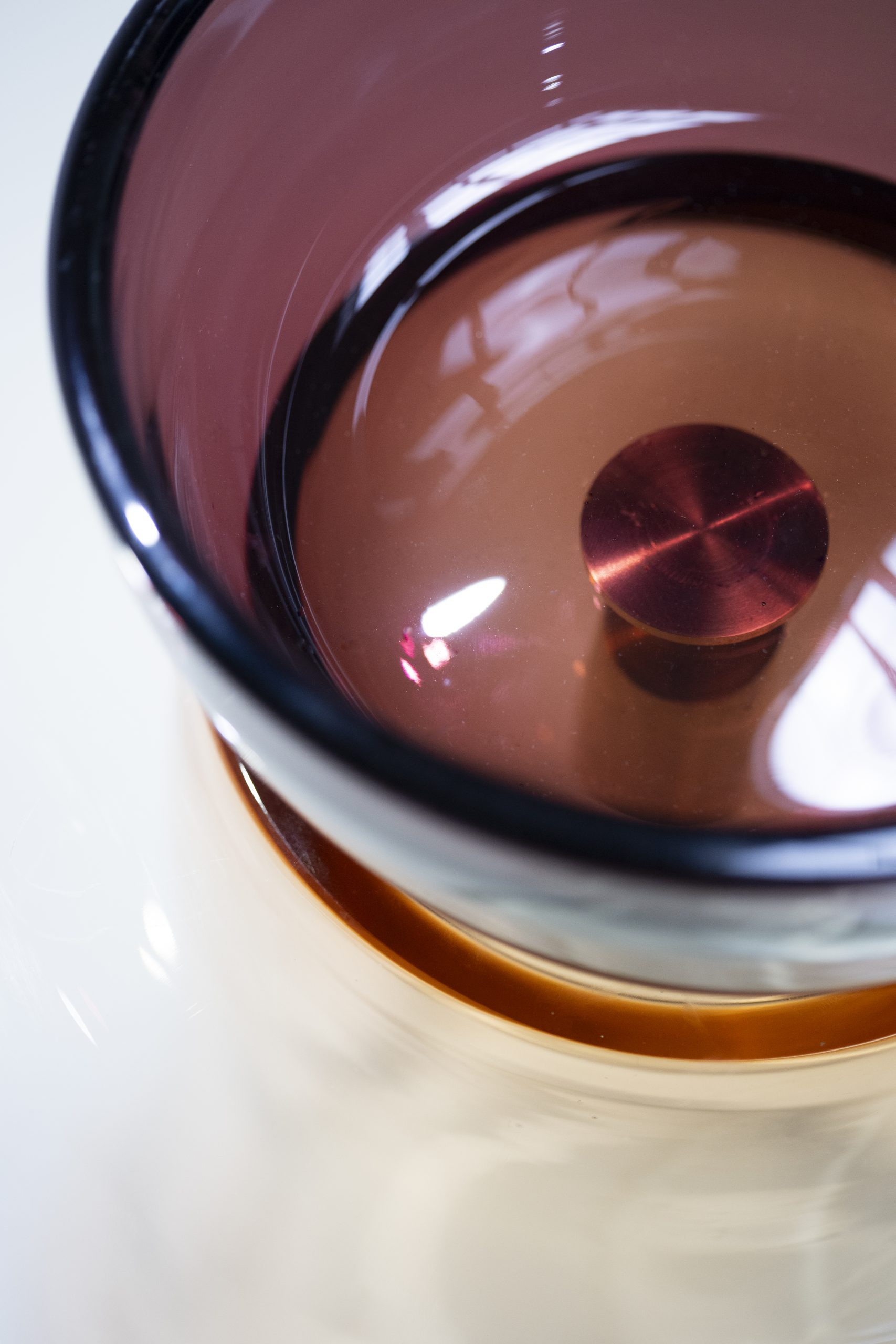
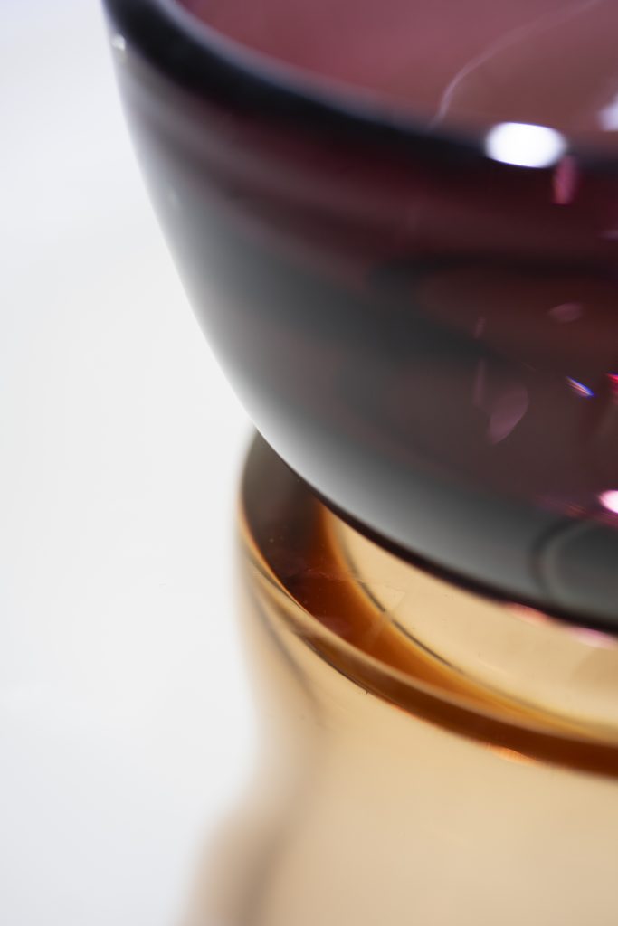
- | detail of the Murano Glass table "Angel" by Paritzki&Liani, ph. VisualWorld

-

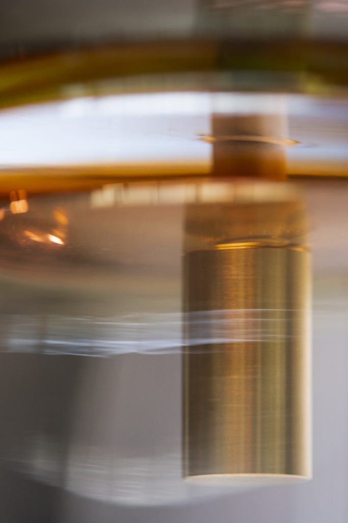
- ph. VisualWorld
-
- ph. VisualWorld
Vetro e arredo, una felice congiuntura a cui siamo sempre più abituati ma che non risparmia criticità o forse semplicemente attenzioni particolari.
Come avete risolto il tema incastro-stabilità-solidità al cospetto della fragilità del materiale?
Come abbiamo scritto per la presentazione del progetto al Fuorisalone di quest’anno, Angel rappresenta una specie di piccola ribellione al “divieto del difficile”, cercando di portare il vetro di Murano al massimo della sua tecnica e modellazione materica, per comporre un oggetto che è un luogo di luce, fra un atto e l’altro della quotidianità. I tavoli sono composti da tre elementi, base, piano e bowl. In fase di sviluppo si sono immaginati diversi agganci e possibili connessioni fra la base e il piano, mentre la bowl è sempre rimasta libera. Nella composizione presentata quest’anno abbiamo optato per il fissaggio fra le due parti (base piano) con un cilindro in ottone tornito a mano composto da due parti, un tappo filettato e dal corpo forato, un tieni anime che serve anche a poter gestire le tolleranze del vetro che qui è di spessori importanti. Il vetro soffiato è struttura, è il nostro materiale d’elezione nel legame indissolubile e magico che si mantiene fra dimensione estetica e tecnica. La struttura, la materia densa dei veli di colore allora riflettono sia le atmosfere mutanti del sole sia di rimando i riflessi taglienti dei raggi di luce artificiale che lo illuminano la notte.
Il vetro soffiato è struttura, è il nostro materiale d’elezione nel legame indissolubile e magico che si mantiene fra dimensione estetica e tecnica.
Angel, un nome etereo per un pezzo di grande poesia che delega al colore un ruolo importante. Monocromo o policromono, sono le tonalità polverose della pittura rinascimentale a definire il carattere di arredi leggeri ma che paradossalmente fanno della trasparenza un punto di forza. Quali le fonti della ricerca che ha definito il carattere di Angel?
L’ispirazione dei colori di Angel nasce dall’osservazione di manufatti della pittura a chiaro-scuro monocromi realizzati all’interno della tradizione pittorica italiana di fine 400, tradizione che si è perpetuata fino al ‘600.
Le tonalità rosè, ocra, grigio si affiancano a colori più decisi quali il verde muschio, il blu profondo, l’ametista. In questi abbinamenti colore l’interesse è quello di ridurre la gamma cromatica e di poter comporre i colori dei tre pezzi – base, piano, bowl – liberamente o di presentarli come monocromi.
Una svolta lo sguardo e il riguardo al delicato disegno e dei colori di Duccio di Buoninsegna all’Annunciazione o La guarigione del cieco. Un dipinto autografo di Duccio di Buoninsegna appartenente alla predella della Maestà del Duomo di Siena realizzato con tecnica a tempera su tavola fra il 1308 e il 1311 (43,5 x 45 cm.) attualmente esposto alla National Gallery di Londra e ai pittori del ‘300 della scuola senese. Il trattamento cromatico delle figure-colore e dell’architettura-fondo centrato nel manto blu, sfuma con i colori in riduzione accompagnando la continuità gestuale tra i vedenti e il cieco guarito. La città sul fondo media fra la scena, nella precisione dei piani facciata grigi e rosati e il fuori le mura del paesaggio senese. Dal ‘300 fino al ‘600 il chiaroscuro ha restituito con una tavolozza ridotta tutta la “complessità teorica di un’opera pittorica” come scrive Giovanni Paolo Lomazzo nel 1590 in Idea del tempio della pittura da questo concetto l’inizio, l’interesse per la riduzione della gamma cromatica e del monocromo e poi del segno.
I misticismo che permea lo spazio della tavola, la luce delle macule, il colore del dipinto autografo di Duccio, hanno guidato il montaggio, la composizione e la luce dei pezzi.
Angel by Paritzki&Liani x Purho, ph. VisualWorld
Trasparenti anticipazioni per Purho?
Architetture ancora, che vogliono essere l’impulso di un nuovo luogo dentro un altro luogo, ancora la casa.
In conversation with Paola Liani,
co-founder of the Tel Aviv-based studio Paritzki&Liani,
discovering and navigating the folds of Angel.
Between arrivals and departures, temporary landings,
artistic suggestions and glass, that of Murano.
Here interpreted for Purho.
Tel Aviv, the base.
Ischia, the landing place.
Paris, Venice, Milan… the cities of a monthly, never-ending round trip.
Landings and departures, the journey as a dimension in/of everyday life and as the possibility of living between geographically distant places and temporalities is a misalignment, a deviation. You find yourself re-starting and rearranging your programs continuously. This allows me, thanks to my work, to shape perception, relationships between people, connections between things, photographic affections in a new cognitive form, with respect to the facts of existence and therefore of the project.
And then there is a centre, the places rooted within us that always accompany us throughout our entire life until we build our own stratigraphy. This is our own landscape. Surely the edges of the river flow with me among the woods and brambles of the moraine hills of Friuli, the desert that descends beyond Jerusalem, the mixture of colours that fade into the sky of the Venetian lagoon and any sudden and rapid sea weather… so the cities become other niches.
From important projects mainly for private homes and collectors to urban housing blocks in Tel Aviv, to the change of scale for what you have defined as “a small architecture for the home”. How did you approach the design of Angel?
Working for years on the domestic project and above all on its mutations and representations, and designing hybrid types and places in the domestic landscape, such as the house-museum, the house-studio-workplace, the secret house-ashram and others, the mimetic-defence-home, the emergency one, it is natural and important for us to bring out of these stories objects that are a mise-en-abîme, a descent into the depths of the project.
For this reason, we have also defined the Angel tables as small pieces of architecture for the home, imagined as objects that give a slight boost to our perception, as good architecture should. They are precious everyday objects, being Murano glass, they create a cross-play with light, they change in transparency, reflections and colour as the light source changes, creating unexpected details for brief moments. Since these are tables with heights of 35cm and 44cm, they are objects open to the various functional possibilities of home life.
Glass and furniture, a lucky link to which we are increasingly accustomed, but which does not spare any critical issues or perhaps simply special attention.
How did you solve the interlocking-stability-solidity theme in the face of the fragility of the material?
As we wrote for the presentation of the project at this year’s Fuorisalone, Angel represents a kind of small rebellion against the “prohibition of the difficult” trying to bring Murano glass to the maximum of its technique and material modeling, to compose an object that is a place of light, between one act and another of everyday life. The tables are made up of three elements: base, top and bowl. During the development phase, various hooks and possible connections were imagined between the base and the top, while the bowl has always remained free. In the composition presented this year we opted for the fastening between the two parts (flat base) with a hand-turned brass cylinder made up of two parts, a threaded cap with a perforated body, a core holder which also serves to manage the tolerances of the glass which here is of significant thickness. Blown glass is structure, it is our material of choice in the indissoluble and magical bond that is maintained between the aesthetic and technical dimensions. The structure, the dense material of the veils of colour then reflect both the changing atmospheres of the sun and in return the sharp reflections of the rays of artificial light that illuminate it at night.
Angel, an ethereal name for a piece of great poetry that delegates an important role to colour. Monochrome or polychrome, the dusty shades of Renaissance painting define the character of this light furnishings, which paradoxically make transparency the strong point. What are the sources of the research that defined Angel’s character?
The inspiration for Angel’s colours comes from studying objects made using monochrome chiaroscuro painting style from the Italian pictorial tradition of the late 15th century to the 17th century.
The shade of rosè, ochre, grey are combined with bolder colours such as moss green, deep blue, amethyst. In these colour combinations the purspose is to reduce the chromatic range and to compose the colours of the three pieces – base, top, bowl – freely or to present them as monochrome pieces.
A turning point is the gaze and the respect for the delicate design and colours of Duccio di Buoninsegna at the Annunciazione o La guarigione del cieco. An autograph painting by Duccio di Buoninsegna belonging to the predella of the Maestà of the Cathedral of Siena made with the tempera technique on wood between 1308 and 1311 (43.5 x 45 cm.) currently exhibited at the National Gallery in London among the 14th century artists of the Sienese school. The chromatic treatment of the colour-figures and of the background-architecture centered in the blue mantle, fades with the colours in reduction, accompanying the gestural continuity between the sighted and the healed blind man. The city in the background mediates between the scene, in the precision of the gray and pink façade plans, and the Sienese landscape outside the walls. From the 14th to the 17th century, chiaroscuro restored all the “theoretical complexity of a pictorial work” with a reduced palette, as Giovanni Paolo Lomazzo wrote in 1590 in Idea del tempio della pittura from this concept the beginning, the interest in the reduction of the chromatic range and of the monochrome and then of the sign.
Te mysticism that permeates the spaces pf the table, the light of the speckles, come from the colours of Duccio’s signed painting which guided the assembly, composition and light of the pieces.
Transparent previews for Purho?
Still architectures, which want to be the impetus for a new place within another place, always the home.