Scroll down for the English version
VOLUME FIRST!
L’occasione per presentare il lavoro di Filippo Feroldi è quanto mai attuale. Dal 9 al 14 aprile, infatti, l’architetto e designer bresciano ha presentato Holo e Magus, due nuove linee in edizione limitata realizzate per Purho e Colleoni Arte in cui la commistione tra vetro di Murano, vetro retro-laccato e tessuto instaurano una nuova relazione. Prodotti che riflettono un approccio al progetto molto raffinato, attento all’uso del colore, del tessuto, spesso accostati in maniera inusuale, quasi audace ma senza stridore.
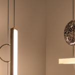
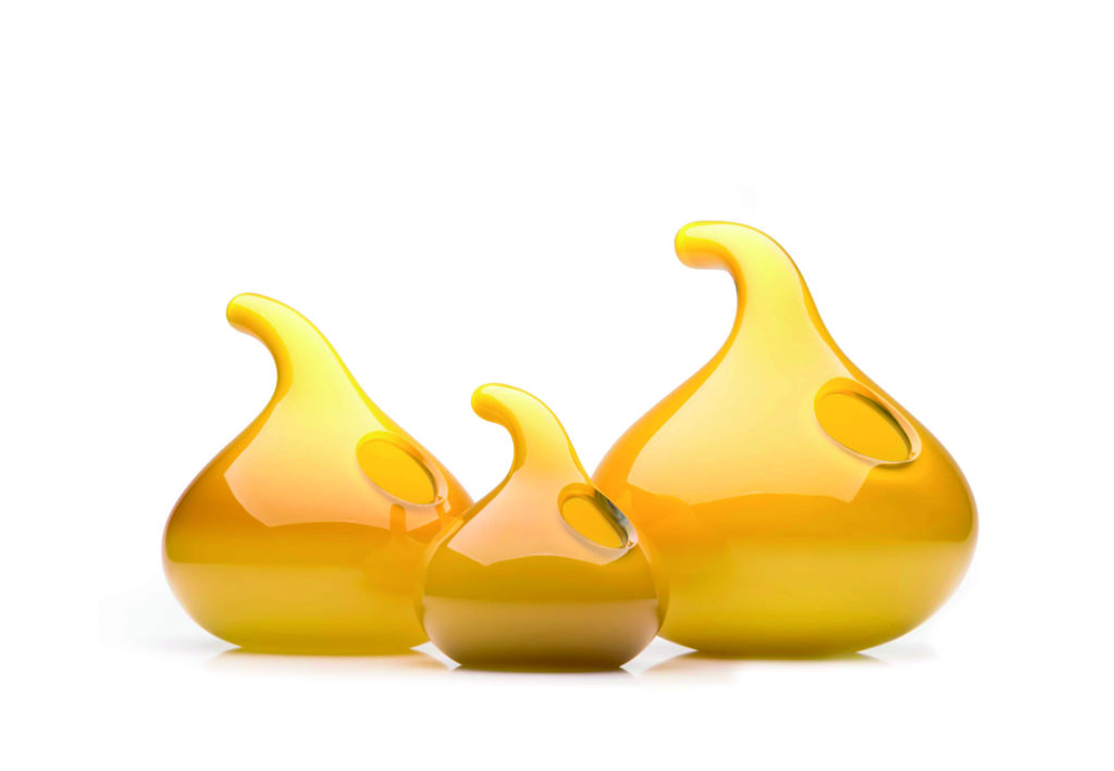
Mugus 13 – Holo 130 by Filippo Feroldi x Purho+ColleoniArte, ph. Valentina Cunja
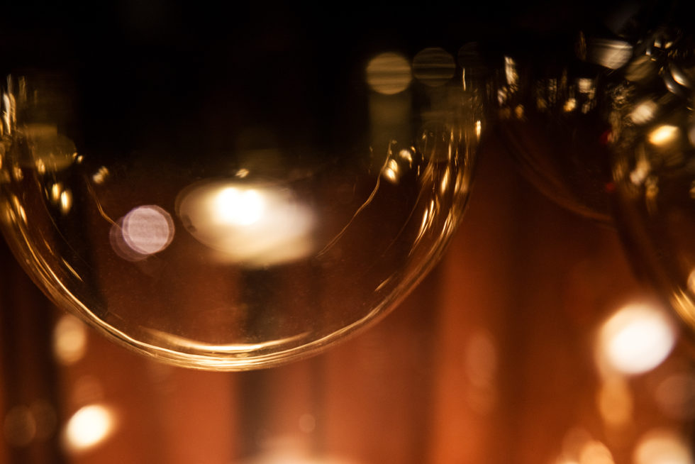
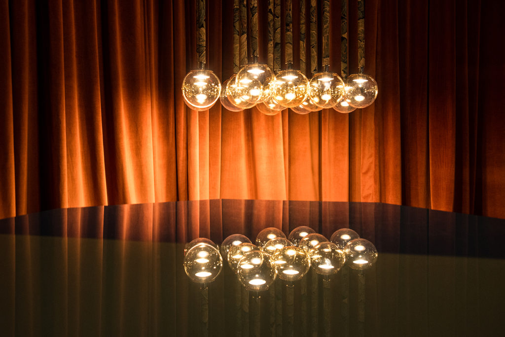
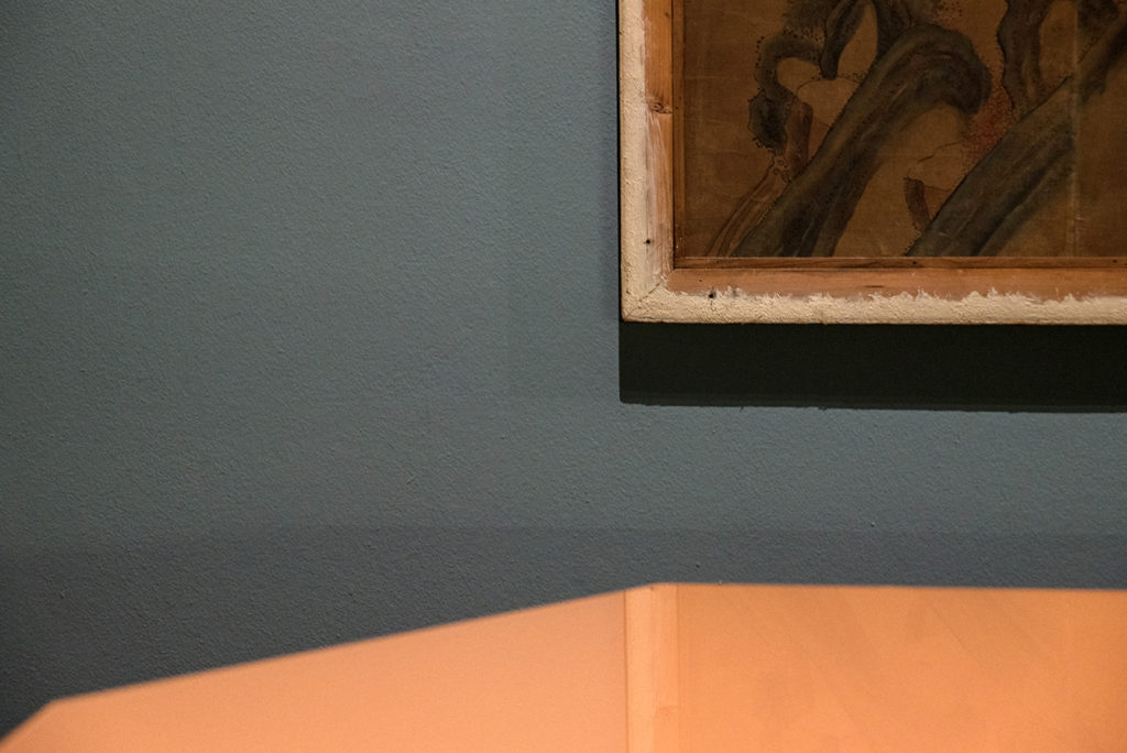
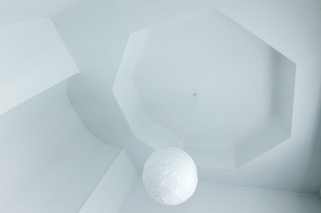
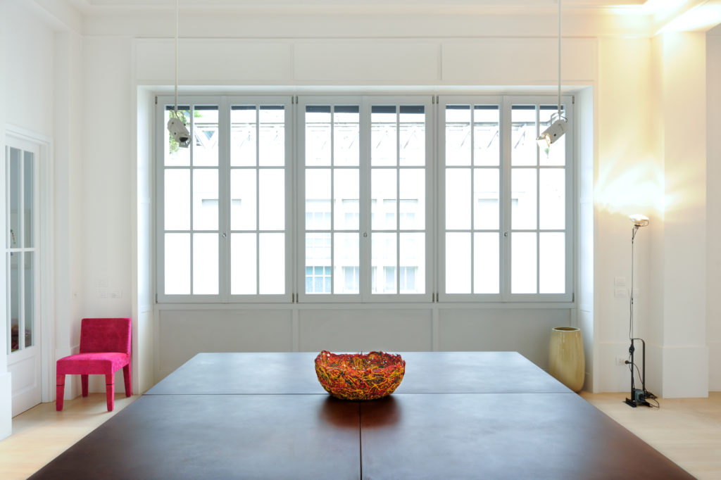
Lavori che denunciano la vocazione architettonica di Feroldi e che diventano progetti totali. Così è stato anche per INCALMO, l’installazione pensata per accogliere — in occasione della Milano Design Week 2019 — i nuovi tavoli Holo e le luci della famiglia Magus. Più che un’installazione, un ambiente immersivo quello progettato da Feroldi in cui stoffe di diverse consistenze, velluti, sete e un pavimento in fibra di cocco restituiscono una scala cromatica intensa, integrazione perfetta tra ambiente e prodotto.
Approfondire il lavoro di Feroldi però non è opera facile. Pochi i riferimenti ai tanti progetti di interior realizzati negli anni, poche le foto, di siti neppure a parlarne. Conoscendolo, tutto in perfetta sintonia.
La breve bio riporta: “Cresciuto tra Milano, Parma e Brescia, Filippo Feroldi si laurea in Architettura alla IUAV a Venezia nel 1981. Dopo un lungo periodo di viaggi tra America e Asia, apre il suo studio che nel corso degli anni, in Italia come all’estero, lo porta ad occuparsi di svariati temi progettuali, dal restauro al riuso, dalle nuove costruzioni alla progettazione di giardini fino al progetto d’interni per il quale designa i singoli pezzi d’arredo. Il vetro è la nuova sfera d’indagine che occupa la più recente produzione”.
AJ — In questa moltitudine, quali le chiavi di lettura di Incalmo?
FF —Semplicemente il desiderio di tornare all’artigianalità.
AJ — Da dove nasce questa fascinazione e unicità nell’uso del colore? Ma soprattutto quali i riferimenti culturali, artistici ad un uso così personale del colore?
FF — Sono cresciuto a pane e colori da quando sono nato nel vero senso della parola.
Mio nonno è stato un grandissimo collezionista che mi ha introdotto all’arte, al colore. Fino a quindici anni ho sperimentato con quanto ho potuto: l’uso della tempera, della matita, dell’incisione, della pittura su ceramica. Poi all’improvviso ho smesso per vedere il mondo…
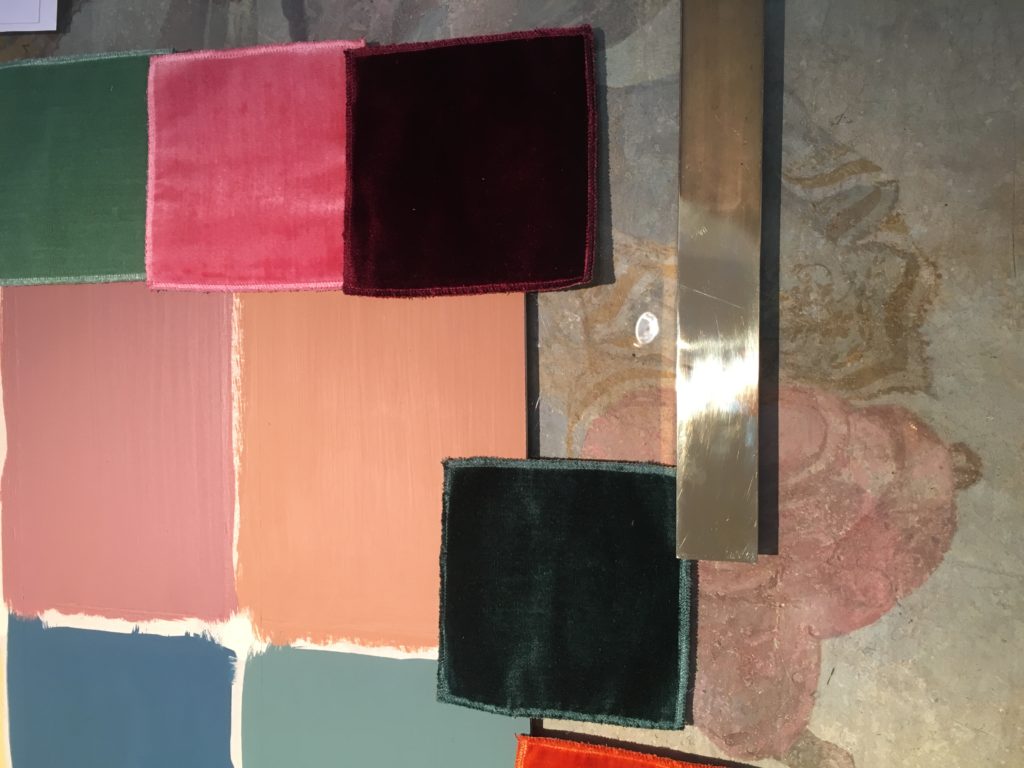
Tornando alla domanda iniziale, il colore è imprescindibile. È strutturale. È la sostanza, non è l’appoggio!
Il colore parla anche della voglia di forma pura, decisamente non facile da ottenere quando il binomio con cui ci si confronta vede da un lato la forma e dall’altro l’artigianato.
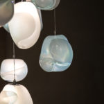
Detail of INCALMO set up at MDW19 curated by Filippo Feroldi x Purho+ColleoniArte, ph. Valentina Cunja
Il colore è imprescindibile. È strutturale. È la sostanza, non è l’appoggio!
Colour test by Filippo Feroldi
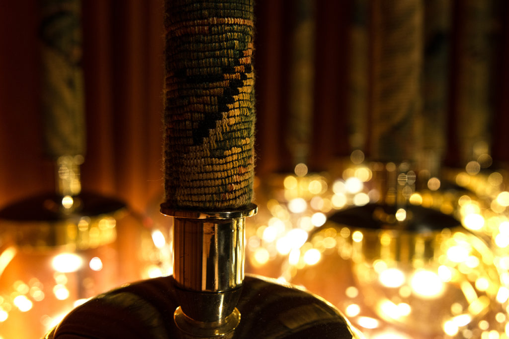
AJ — Il tessuto occupa nella tua produzione un ruolo centrale tanto da sperimentare con Magus la commistione con il vetro di Murano. Credi si possa osare di più ed estendere il tessuto ad ambienti e applicazioni ancora non osate?
FF — Il tessuto è il canale più veloce per costruire un’atmosfera. Ma non è solo questo. Trovo divertente mettere assieme materiali apparentemente diversi, legarli al concetto di trasparenza così come è avvenuto con Magus. Ottone, tessuto e vetro ad esempio non hanno un lessico comune, ma la volontà di farli dialogare ha dato vita ad un progetto di illuminazione in cui tutti gli elementi sono integrati.
Magus 13 [ fabric detail ] by Filippo Feroldi x Purho+ColleoniArte, ph. Valentina Cunja
AJ — Design di prodotto, interni, architettura, giardini… la tua produzione sembra figlia di approccio al progetto non così contemporaneo, in cui la scala diventa relativa. Dove ti trovi di più a tuo agio?
FF — Ritengo che la specializzazione sia fondamentale per stare a galla, ma la curiosità è qualcosa di superiore, aiuta ad allargare gli orizzonti.
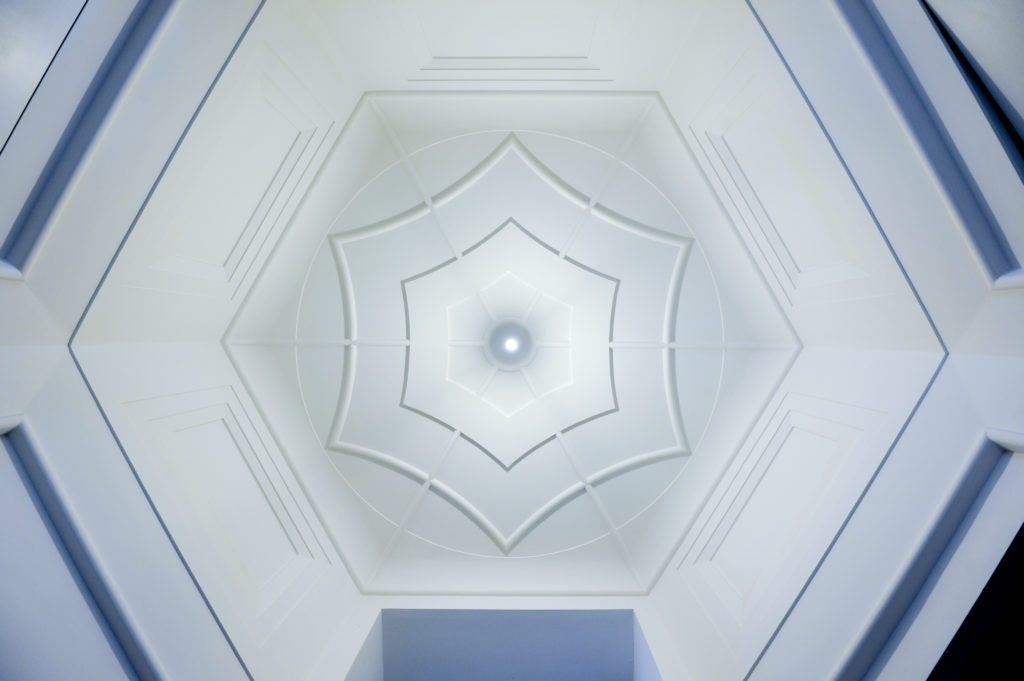
Per questa ragione parlare di scala è riduttivo. D’altronde provengo da una scuola impostata sui volumi. Nomi come Scarpa, Tafuri, Gregotti hanno dato la direzione a quella che è stata la mia formazione che oggi spazia dall’architettura al prodotto, dall’interior al verde che rimane una delle mia grandi passioni.
Non è a caso sono molti i giardini con i quali mi sono confrontato in questi anni. Non solo per l’opportunità di giocare con i volumi, ma anche perché devi prevedere il futuro. Quello che impianti oggi lo vedrai tra dieci anni. L’aspettativa, la sorpresa, l’esuberanza della natura sono impagabili. Regalano quell’elemento di sorpresa e di rottura che ricerco sempre nei miei progetti. Di qualsiasi scala si tratti.
Architectural detail by Filippo Feroldi
Provengo da una scuola impostata sui volumi
Architectural detail by Filippo Feroldi
AJ — Un nome a cui guardi con interesse nell’ambito del green?
FF — Piet Oudolf senza dubbio.
AJ — Il vetro è entrato nella tua produzione solo di recente.
Dapprima con Zucche, piccoli e coloratissimi vasi per Purho, ora con queste edizioni che fanno il loro debutto ufficiale al Fuorisalone 2019.
Prossimo prodotto?
FF — Il vetro è un materiale difficile ma bellissimo. Mettere assieme la visione del designer e quella del Maestro soffiatore non è facile, ma l’idea di realizzare dei vasi mi intriga molto.
Quanto taglio i fiori del mio giardino sono sempre in difficoltà sulla scelta del giusto contenitore. Questo mi darebbe la possibilità di dare forma al mio pensiero soddisfacendo pure una mia necessità… come vedete il verde torna sempre.
Zucche vases [ Murano blown glass ] by Filippo Feroldi x Purho
AJ — Un progetto nel cassetto?
FF — Un albergo.
Perché un albergo fa compagnia e poi racchiude talmente tante cose…. li si che la scala perde di significato.
Ad oggi un progetto molto interessante dedicato al mondo dell’ospitalità con il quale mi sono confrontato è Palazzo Castiglioni a Mantova nel quale ho ricavato sei suite da un unico volume. Un progetto complicato per i vincoli e criticità dello spazio che mi ha dato grandi soddisfazioni. Il colore, gli affreschi, i dettagli degli arredi sono stati una sfida… ancora aperta a dire il vero essendo un progetto work in progress.
AJ — L’architettura più amata?
FF — Borromini ma sono onnivoro, ogni epoca ha avuto la sua perla e tutte fanno una collana.
AJ — Infine, un’ultima domanda nata girovagando qua e là nel tuo passato.
Ho letto che nel 2009 — in occasione della mostra Yona Friedman, cartoline postali — hai affrontato assieme al professor Franco Buncuga il lavoro del grande architetto ungherese di nascita ma francese di adozione. Il nostro studio, o meglio, la mia collega Giovanna Felluga intrattiene un rapporto di grande affetto umano e professionale con Friedman tanto da averlo inviato a realizzare, assieme Jean Baptiste Decavèle e grazie alla collaborazione con Ram Radioartemobile, il Vigne Museum sulle colline di Rosazzo in occasione dei 100 anni di Livio Felluga, fondatore dlel’omonima azienda.
Vuoi lasciarci un tuo pensiero riguardo Friedman e il suo lavoro?
FF — In quell’occasione abbiamo parlato di utopia in quanto libertà di pensiero. Utopia che purtroppo oggi si è persa se non in rari straordinari casi. Yona Friedman è uno di questi.
L’utopia in quanto libertà di pensiero purtroppo oggi si è persa se non in rari straordinari casi. Yona Friedman è uno di questi.
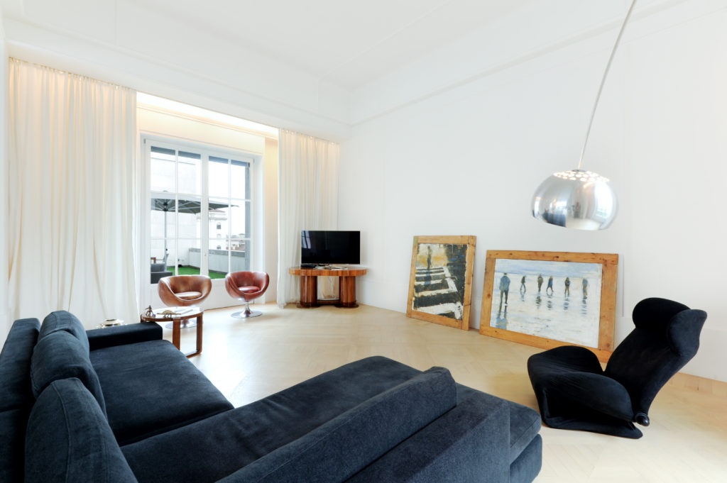
Interior project by Filippo Feroldi
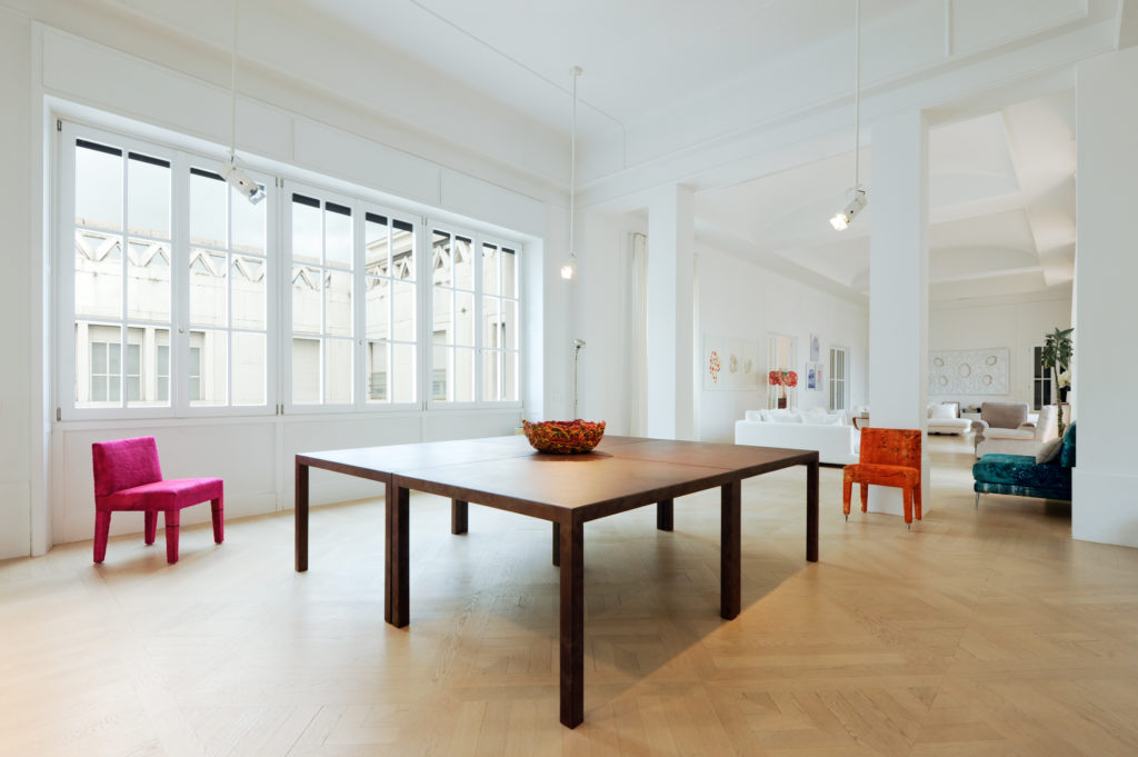
Interior project by Filippo Feroldi
Interior project by Filippo Feroldi
Interior project by Filippo Feroldi
***
VOLUME FIRST!
The opportunity to present the work of Filippo Feroldi is as timely as ever. From 9 to 14 April the architect and designer from Brescia presented Holo and Magus, two new limited edition lines created for Purho and Colleoni Arte in which Murano glass, retro-lacquered glass and fabric combine to establish a new relationship. Products that reflect a very refined approach to the project, considered use of colour and materials which are often combined in an unusual manner, almost bold but without stridency.
These are works that announce Feroldi’s architectural vocation and become complete projects. Thus it was also for INCALMO, the installation designed to welcome – on the occasion of the Milan Design Week 2019 – the new Holo tables and the lights of the Magus family. More than an installation, an immersive environment designed by Feroldi in which fabrics of different textures, velvets, silks and coconut fibre flooring echo on an intense chromatic scale, a perfect integration between environment and product.
Developing an in-depth understanding of Feroldi’s work, however, is not an easy task. The references to the many interior projects made over the years are scarce, there are hardly any photographs of sites, he does not even talk about them. Knowing him, everything is in perfect harmony.
His brief biography states: “Growing up between Milan, Parma and Brescia, Filippo Feroldi graduated in Architecture from IUAV in Venice in 1981. After a long period of travel around America and Asia, he opened his studio which, over the years both in Italy and abroad, has led him to work with various design themes, from restoration to reuse, from new buildings to garden design and on to interior design for which he creates individual pieces of furniture. Glass is a new sphere of inquiry that engages his most recent work”.
AJ — Among this multitude, what are the keys to reading Incalmo?
FF — Simply the desire to return to craftsmanship.
AJ — From where does this fascination and unique use of colour come? But above all what are the cultural and artistic references for such a personal use of colour?
FF — I grew up on bread and colour from my birth – in the true sense of the word. My grandfather was a great collector who introduced me to art, to colour. Up to the age of fifteen I experimented with what I had: the use of tempera, pencil, engraving, ceramic painting. Then suddenly I stopped, to see the world …
Returning to the initial question, colour is essential. It’s structural. It is the substance, it is not the outward sign!
Colour also speaks of the desire for pure form, definitely not easy to obtain when the combination with which we are confronted sees form on the one hand and craftsmanship on the other.
Colour is essential. It’s structural. It is the substance, it is not the outward sign!
AJ – Textile occupies a central role in your creation, so much so that you have experimented with combining it with Murano glass with Magus. Do you think you can be more daring and extend the fabric to environments and applications which you haven’t risked so far?
FF — Textiles are the speediest channel for building an atmosphere. But not only that. I find it fun to put seemingly disparate materials together, joining them through the concept of transparency as happened with Magus. Brass, fabric and glass, for example, do not have a common lexicon, but the desire to make them talk has given birth to a lighting project in which all the elements are integrated.
AJ — Product design, interiors, architecture, gardens … your work seems to derive from a not so contemporary approach to design, in which the scale becomes relative. Where do you feel most at ease?
FF — I believe that specialisation is fundamental for staying afloat, but curiosity is somehow superior, it helps to broaden our horizons.
For this reason, talking about scale is an understatement. Moreover, I come from a school based on volume. Names like Scarpa, Tafuri, Gregotti have given direction to what was the basis of my training, and which today ranges from architecture to products, from interiors to green spaces, which remain one of my great passions.
It is not by chance that I have been confronted by so many gardens over the years. Not only because of the opportunity to play with volumes, but also because one must have the ability to foresee the future. What you plant today you will see in ten years. The expectation, the surprise, the exuberance of nature are priceless. They give that element of surprise and of rupture that I always look for in my projects. Whatever their scale.
I come from a school based on volume.
AJ — A name which you watch with interest in the context of green spaces?
FF — Piet Oudolf without doubt.
AJ — Glass has only recently entered your work. First with Zucche, small and colourful vases for Purho, now with these pieces that are making their official debut at Fuorisalone 2019. Your next product?
FF — Glass is a difficult but beautiful material. Putting the designer’s vision together with that of the Master blower is not easy, but the idea for the vessels intrigues me greatly. When I cut the flowers in my garden I always have difficulty in choosing the right container. This has allowed me the opportunity to shape my thoughts and satisfy my needs … as you can see, green is ever-present.
AJ — A dream project?
FF — A hotel.
Because a hotel holds a large company and thus contains so many things … that the scale becomes meaningless.
So far, a very interesting project dedicated to the world of hospitality with which I was faced is Palazzo Castiglioni in Mantua, where I created six suites from a single concept. It was a complicated project due to the constraints and problems of the space, but one that gave me great satisfaction. The colour, the frescoes, the details of the furnishings were a challenge … one that is still ongoing, to tell the truth, a work in progress.
AJ — The architecture you love most?
FF — Borromini, but I am omnivorous, every age has had its pearl and they all make a necklace.
AJ — Finally, a last question that springs from your wanderings in the past.
I read that in 2009 – on the occasion of the Yona Friedman exhibition, Postcards – together with Professor Franco Buncuga you tackled the work of the great architect, born in Hungary but French by adoption. Our studio, or rather, my colleague Giovanna Felluga maintains a relationship of great human and professional affection with Friedman so much so that she has worked hard to create, together with Jean Baptiste Decavèle and thanks to the collaboration with Ram Radioartemobile, the Vigne Museum in the hills of Rosazzo on the occasion of the centenary of Livio Felluga, founder of the company of the same name. Would you like to leave us with your thoughts about Friedman and his work?
FF — On that occasion we talked about utopia as freedom of thought. A utopia which unfortunately has been lost today except in rare extraordinary cases. Yona Friedman is one of them.
Utopia as freedom of though has been lost today except in rare extraordinary cases. Yona Friedman is one of them.